Making data lineage legible
Column-level lineage is a hairball by nature — thousands of assets, hundreds of edges per node, across every warehouse and BI tool a company runs. Engineering had a prototype; I designed it into the graph data teams work in today.
Datafold is a data-observability platform: it tells data engineers whether a change they're about to ship will quietly break something downstream. Column-level lineage answers one question — "if I change this column, what breaks?" Engineering had built a prototype that technically answered it, but it was difficult to read the answer. I joined Datafold in 2021 as the company's first design hire. Over three years I owned the design of the surface that made lineage usable — and it became the feature Datafold's entire lineage story is now sold on.
Context
A data team's warehouse is a web of dependencies. A raw events table feeds a dbt model, which feeds another model, which feeds a Looker dashboard the CFO reads every Monday and a Hightouch sync pushing segments into the marketing tool. Change one column at the top — rename it, recalculate it, drop it — and the blast radius runs through everything below.
Lineage is the map of that web. Datafold builds it by parsing every SQL statement that hits the warehouse, down to the column, across source data, dbt models, and the BI and reverse-ETL tools downstream. That parsing was engineering's hard-won achievement. The jobs the map has to serve are concrete:
- 01Impact analysis — before shipping a model change, see which downstream tables, dashboards, and syncs break, and how important they are.
- 02Upstream discovery — trace a dashboard metric back to its real source. Lossy front-end events or reliable backend ones? Can I trust it?
- 03PII tracing — a single table mixes sensitive and non-sensitive columns, so compliance work follows one field across every transformation it flows through.
- 04Incident debugging — a number looks wrong in a report; walk backwards to where it went wrong.
Problem
Engineering had built something that technically worked. It listed every table, every column, and every connection between them — a complete map of the warehouse. What it didn't do was let anyone use it.
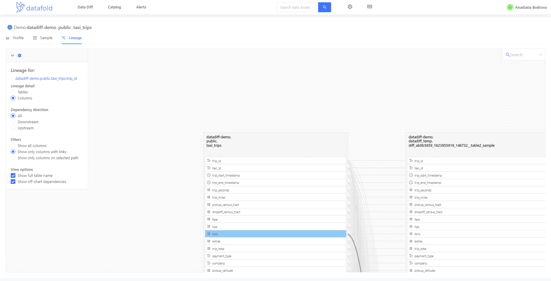
database.schema.table.Performance was the first wall. The backend returned an enormous payload — everything at once — and the view could take several minutes to render. Once it was up, any interaction (a pan, an expand, a filter change) triggered another long wait. In practice the tool was unusable for the day-to-day question — "if I change this column, what breaks?" — because the answer arrived too slowly to be part of a code review.
The second problem was signal. Not everything on the map mattered equally to the person looking at it. To make lineage usable, we had to decide what to not show by default — how to limit what's on screen so the view renders fast, is navigable, and reads at a glance: where to move, what to open, what to ignore. The design work started there.
Process
The redesign ran through the classic NN/g design thinking arc — used less as a linear checklist and more as a way to keep asking which phase needed more evidence next.
Empathize. The company had no product analytics wired to lineage, so I couldn't tell what was working from a dashboard. I watched Datadog session replays to see how people actually moved through the graph — where they zoomed, where they scrolled off-canvas and never came back, which filters they touched, and which they stared at without touching. I paired the replays with shadowing data engineers on impact-analysis walks. That was the ground truth.
Define. One pattern sat under everything: the moment the graph got bigger than a screen, people stopped navigating and started giving up. That named the crux — never render the hairball; reveal the graph one deliberate step at a time. Every subsequent decision had to earn its place against that one line.
Ideate. The redesign moved on three fronts in parallel:
- 01The card. Every screen has one, thousands of times. Fix the card and the graph inherits it.
- 02The graph mechanics. Depth, expansion, search — how you pull the next piece without drowning.
- 03The bridges. Lineage is worth more when it's one click from the place the question was asked. Data Diff was the biggest one.
Prototype. The card became a node system before it became a shape — collapsed and expanded states across every asset type. The graph mechanics settled into max-depth plus click-to-expand with the edge counters. The bridges started with a Diff → Lineage jump-in from any changed column.
Test. Some concepts made it to a validation round and didn't survive. Grouping was the biggest: bundling schema-mates or dozens of downstream syncs into a single group with in-place search and sort. On paper it beat starburst. In practice, when we walked users through it, the mental model didn't hold — nobody could predict what was inside a group without expanding it, and the ceremony of grouping got in the way of the actual question. We killed it and doubled down on search instead.
Implement. Table-level and column-level both shipped; the filter panel and run/popularity enrichments followed after my time.
The surface
The shipped view keeps the graph collapsed, the card informative, and every path — from a column, from a search, from a Diff — one click away.
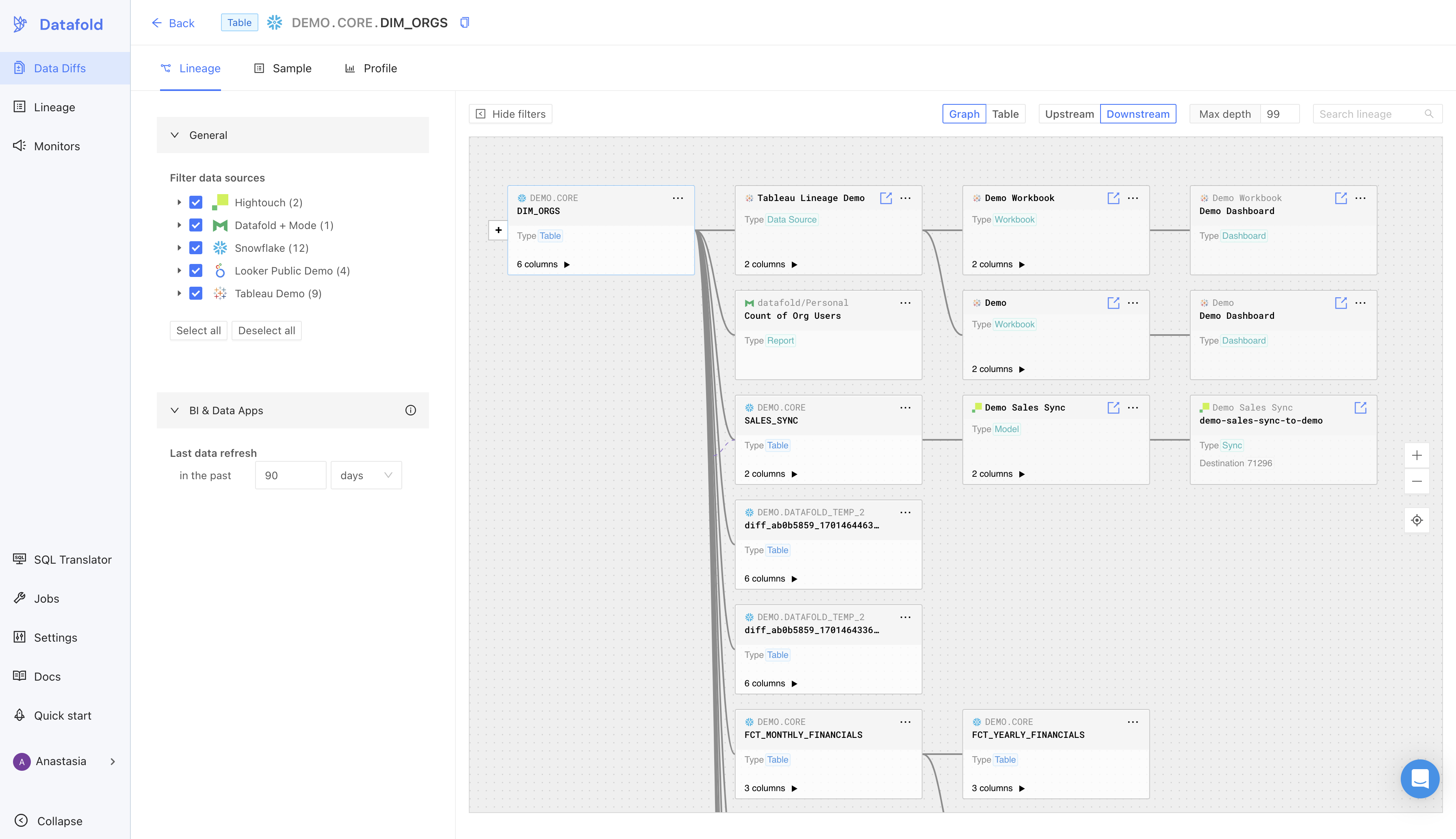
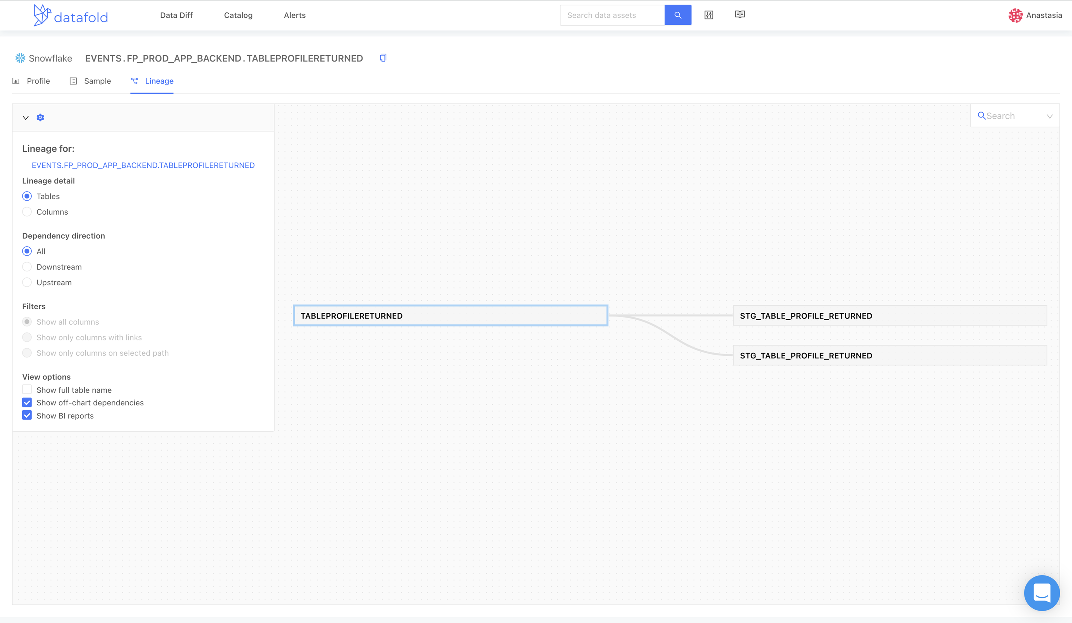 Before
After
Before
After
Same underlying graph the prototype tried to draw all at once — collapsed cards, direction and depth controls promoted to the top bar, filters on the left, search top-right. The frame is calm at any scale.
At the level of a single card, this is what a user gets in one glance: the data source (Snowflake, Hightouch, Looker, Tableau), the fully-qualified path with the table name emphasized and the database.schema. prefix dimmed, the asset type, a column count with an expand affordance, and a small external-link icon that opens the asset in its native tool. Run (freshness) and popularity (a four-bar meter of downstream demand) were designed alongside these and shipped after my time.
Expand a card and the graph switches to column-level: each field is typed, and the edges redraw column-to-column so you see exactly which field feeds which.
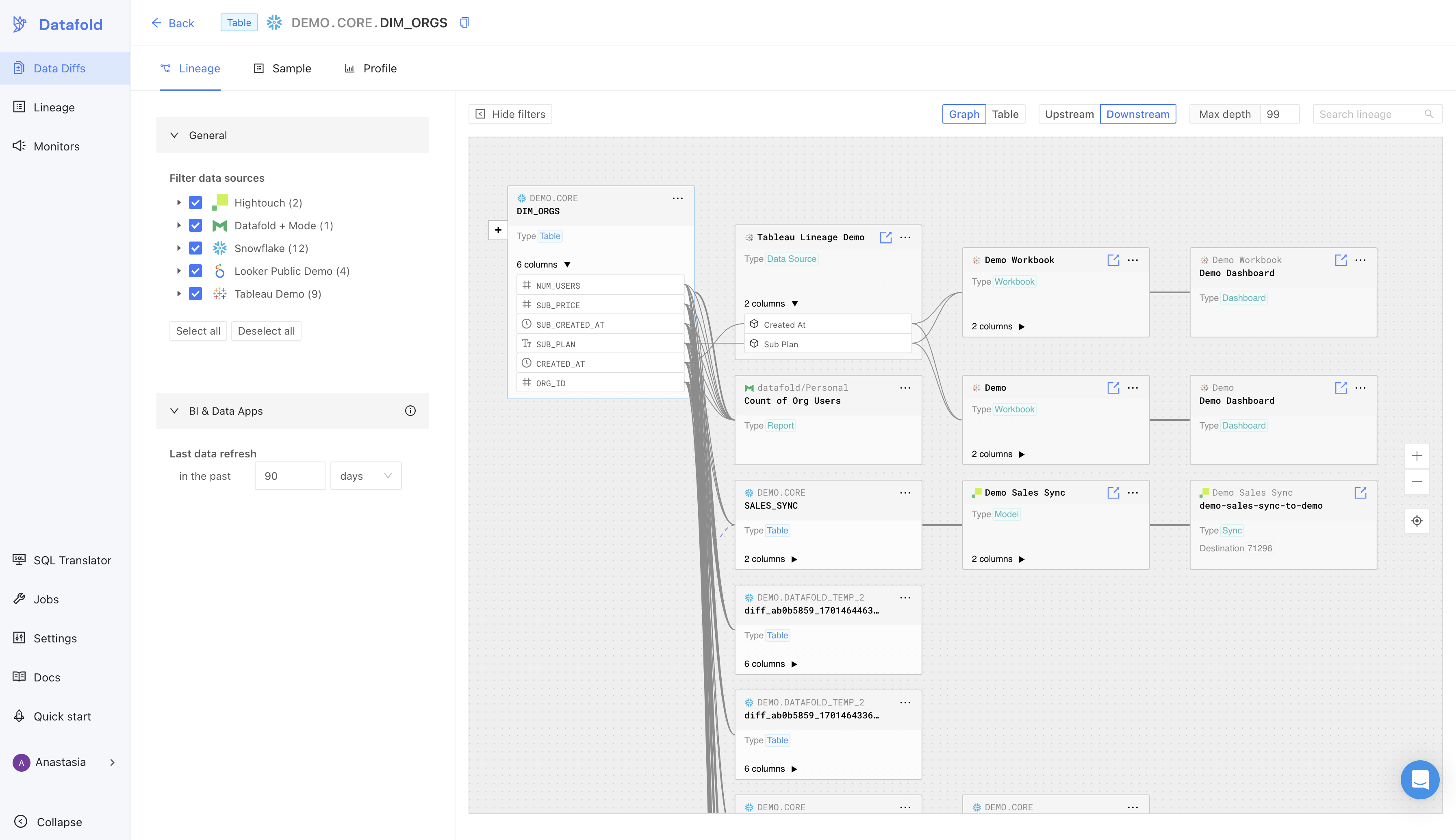
The table-level view stays calm until the question needs the depth.
Design decisions
The card as the atom
The prototype's card was a name. The shipped card is a piece of context.
Snowflake, Redshift, and Postgres use three-part identifiers: database.schema.table. Datafold rendered all three parts equally, so a card read as a wall of upper-case where the meaningful part — the table name — competed with EVENTS and FP_PROD_APP_BACKEND for attention. The redesign dims database.schema. and emphasizes the third segment. That single typographic move restores what the card is for: it names the thing you're tracing.
On top of that the card gained the signals a data engineer weighs before they click further: source icon, type badge, column count with expand affordance, external-link icon. Later additions (run and popularity) let a viewer weigh freshness and downstream demand in the same glance, and let the filter panel narrow the whole graph to only the high-traffic pieces.
Never render the hairball — max depth and click-to-expand
Performance and legibility had the same fix: don't render what wasn't asked for. The redesign put a max-depth input in the top bar (default set conservatively) and drew only that many hops. Each collapsed neighbor becomes a small + counter on the edge: click it and the next hop unfolds in place. The user walks the graph one deliberate step at a time.
The perf win is direct: instead of shipping every asset in the warehouse to the browser, the backend returns only the sub-graph the user's controls describe. Everything after is user-initiated.
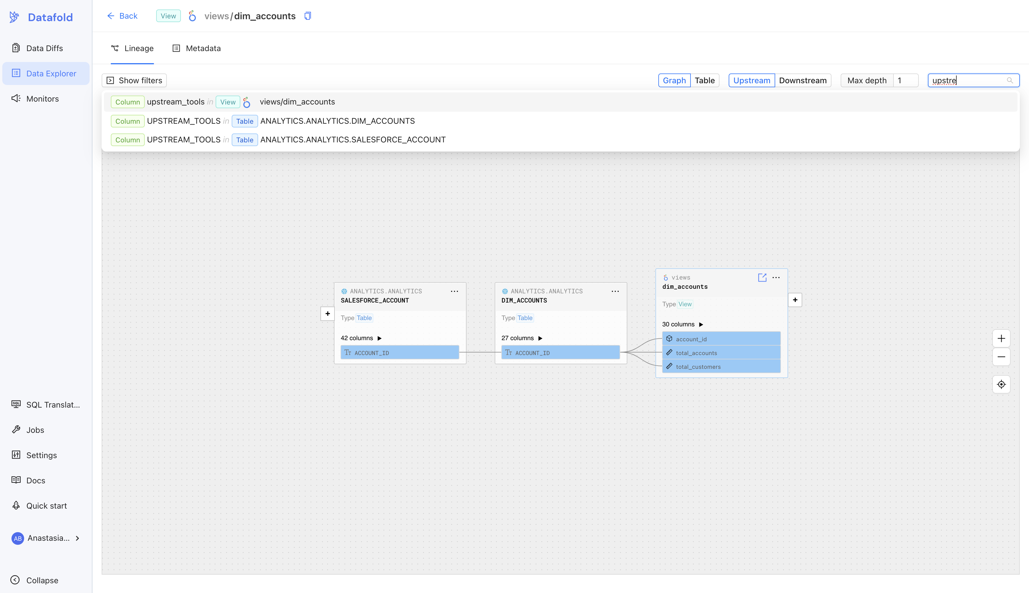
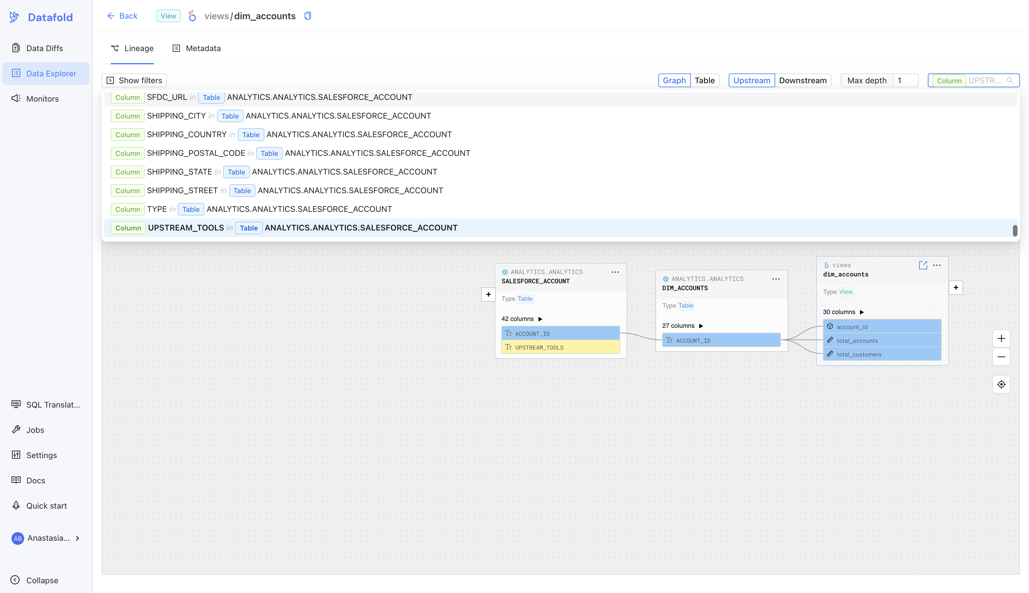
Search for the column, not just the table
The prototype's search only matched table names. Real work — PII tracing, incident debugging, joining across teams — starts with a column name, not a table.
From Diff to Lineage, in one click
Data Diff is the product Datafold is best known for: run a diff between two versions of a model and see exactly which rows and columns changed. But the diff alone doesn't tell you the blast radius — what breaks downstream if this change ships.
The bridge is a per-column "Open in Lineage" link. From any changed column in a diff result, you jump straight to that column's lineage view, at the right depth, focused on the field that changed. It works the other way too — from a lineage node, jump to its most recent diff.
Graph ↔ Table, one toggle apart
Some questions are shapes: what does this look like downstream? Others are lists: give me every affected asset by depth so I can work through them. The top-right toggle switches the same lineage between an interactive graph and a depth-sorted table. The table is scannable, copyable, and the accessible path through a canvas.
Return to origin
The single smallest fix with the biggest response: a target icon in the canvas controls that returns the viewport to the anchor node. Pan a graph two hundred nodes wide and it is genuinely hard to find your way home. One button, immediate ship, immediate uptake.
The concepts that didn't ship (yet)
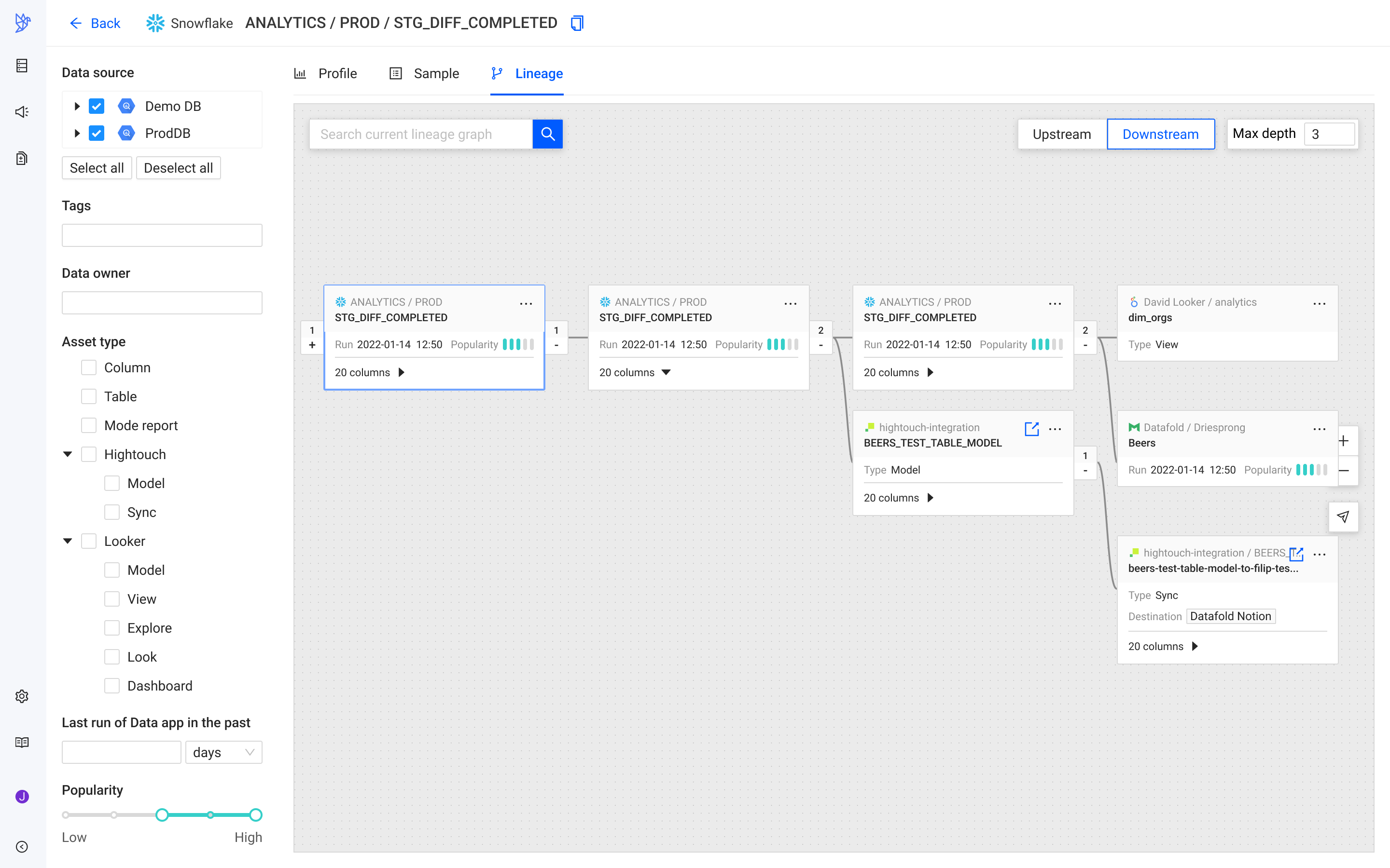
Filters panel — a left rail to narrow the graph by data source, tags, data owner, asset type (column, table, mode report, Hightouch model/sync, Looker model/view/explore/look/dashboard), last run window, and a popularity range slider. Designed as a mock at the time of the redesign; a version of it shipped after I moved off the project.
Trade-offs
Max-depth and controlled reveal buy legibility with clicks. It's the right trade at scale — the whole picture is unreadable at scale — but it costs you the intuition of "let me see the shape" for anyone whose graph would have fit on one screen. We accepted that.
Grouping tested worse than it drew. We shipped search and left grouping in the design as a mock for a future revisit. The lesson wasn't "grouping is bad" — it was that we hadn't found the workflow where grouping was cheaper to reason about than a search box. Without that workflow, the interaction was overhead.
Success
There was no formal metrics infrastructure on lineage when I redesigned it, so I couldn't quote a hard A/B result. What I could do was watch: Datadog session replays made it obvious how the shipped surface was being used differently. The order-of-magnitude signal was a ~40% lift in lineage usage in the months after the redesign, alongside consistent qualitative feedback that the graph was finally usable inside a code review.
The stronger signal is what the surface became internally: the view the lineage value prop is now sold on. Datafold's public writing about lineage — impact analysis, PII tracing, upstream discovery, incident debugging — walks through the shipped UI. The Data Diff → Lineage bridge became a headline pairing in the product story.
[Dutchie] hasn't experienced a single production breakage or outage since implementing Datafold's column-level lineage.
Takeaways
-
01Design the atom first. A graph is a thousand copies of one card. Get the card right — what one glance yields, what one click opens — and the graph inherits it. The prototype's failure was that its card said almost nothing; the shipped card carries the handful of signals a reviewer actually weighs.
-
02Emphasize the referent, dim the namespace.
database.schema.tableis technically correct and cognitively awful. The one part users care about is the last part; typography can carry that alone. -
03Reveal, don't render. Every deferred hop is one less thing the browser fights and one less thing the reader has to filter. Max-depth + click-to-expand is a UX pattern and a performance strategy — you get both from the same decision.
-
04Validate concepts by trying to kill them. Grouping felt inevitable in the design; the validation round showed users couldn't reason about it. Killing that work early was cheaper than shipping and quietly abandoning it.
-
05Watch the sessions when you don't have metrics. Datadog session replays gave me directional truth I would have waited months to see from a proper analytics pipeline. It's not a substitute for measurement, but it's a first-week substitute for guessing.
-
06Build the bridge to the workflow that already exists. Lineage isn't a destination — it's a lookup during a code review, a diff, an incident. The Diff → Lineage hop did more for adoption than any single graph feature, because it put lineage inside the workflow where the question was already being asked.